Saturday, June 30, 2007

Hand-Drawn vs. 3D: Why Realism Isn't Your Friend

There's a rather heated discussion going on in the Comic Genesis forums right now about CGI comics: I say 'heated' because one of the CGI artists there is taking much more offense to the statements and waxing eternal about how "People refuse to give CGI a chance" being made than realizing that it takes more than 'good' art, regardless of the medium, to tell a story in a comic.

I have seen countless artists who put up lovingly crafted pieces of art in their comics. You can tell there was plenty of effort involved in the art itself, but not nearly so much in the story or the staging of the work itself. It's the old conflict between being a cartoonist and being an artist; You can either try to compete with millenia of thought on light and texture and shading, or you can take just enough of each to make your work look acceptable and focus more on being able to tell a story beyond all else.

I'm not saying that CGI is inferior to drawn work; however, I AM saying that the hyperrealistic worlds of Poser, Second Life, and Pixar don't belong in comic books, at least not without a LOT of work into figuring out just what makes a comic good. Certainly CGI can become just as 'awesome' artwise, if not better, than hand-drawn works. However, when we get into panels, lettering, word bubbles, and general portrayal of action, we see the real flaws in CGI comics.

People are used to seeing 'comic' people in 'comic' panels, with 'comic' lettering and 'comic' effects. Realism likewise requires that the narrative that goes with these pictures suits the pictures themselves. Ergo, it's not JUST about the art; it's about the atmosphere this art is presented in.

Imagine seeing a comic character being punched out. When dealing with drawn art, you have all sorts of tools to assist your eye: sound effects, speed lines, deformation of certain body parts involved, and other motion cues that artists have honed and tapped into over several decades of development and cartoon evolution. Because we are used to these cues, we recognize and accept their placement within the comic panel.

Now imagine a photograph of a person being punched out: We don't see the motion lines, speed blurs, or other handy cues that a comic has; if we're lucky, we get some of these superimposed, but the end result is that the superimposed effects don't gel with the photograph, because we are used to seeing them in less realistic conditions. CGI can be compared in the same way.

Now, for further comparison, let's make that photograph a five-second film clip from a movie, so we can see the punch as it's being performed. We can see the motion, hear the sounds involved, and watch the deformation (brief as it may be) occur in the displacement between fist and face, and so the comic elements we depended on are no longer necessary, because we are now looking at animation.

CGI in Animation makes sense the same reason live-action makes sense; we don't need the comic cues of motion and effect to bring the scenes to life, because they're already framed within a medium of motion and effect itself. The motion automatically makes things more realistic to us, and so the added realism of CGI dovetails with it much more nicely in this dynamic medium of flim that it does in the static medium of comics.

Accepting CGI, by nature of the affordances you give up when going from cartoon realism to a hyperrealistic style, means you also give up the ability to tell the same type of story you would be able to depict in a drawing, as well as significantly limiting the type of environment that makes sense otherwise in comics.

As long as the art is merely 'realistic within its medium', it becomes easier to find the right atmosphere for the work. One of my favorites, The Wizard's Tale (an excellent comic book, though sadly just a one-off) bridges this problem nicely, not only combining realism with comic art, but also in its lightly medieval lettering, the statements and other comic elements blending into the world around it, rather than clashing against it.

If you have a crisp environment with crisp words in crisp bubbles, then the art should be just as clean as the surroundings you have them in; if the art is slightly rough at the edges, the environment should be rough to fit. In Pogo, Walt Kelly matches the wild, only slightly tamed environment of the comic with equally bold text and loose word bubbling. The art is secondary compared to the comic's design and the story within it. It either all works together to keep the reader's eyes in the right place, or it will clash with itself and tear everything within the story apart.

Yes, it shouldn't be impossible to make a CGI comic that can match hand-drawn storytelling. But I've not seen it yet.
Thursday, June 28, 2007

4 Pointers for Pin-Ups in Comics


It's sexist, scandalous, and it's time-honored as hell; the 'great american pin-up' spans a lot of different categories and descriptions, but it's a skill worth learning. They make great merchandise graphics, require very little backstory, give you incentive to have women in your plots, and on top of everything else, allow you to give your characters extra depth in otherwise overlooked places, as long as you're not going for out-and-out pornographic material.

Note: No, it's not a feminist-friendly topic or genre, but that's mostly depending on how you do it; Pin-ups, like most artforms surrounding the portrayal of women, have only become 'feminist friendly' (or even started to get in that range) once you started using female protagonists and heroes, and even THEN there's a fair disconnect between a strong woman and what she often gets turned into by the less-than-scrupulous fanboys. The pointers here are designed to balance the pin-up with potency, so that you avoid straying into the fanservice or pornographic labels too easily. Following all these tips won't keep the criticism off your back, but that'll depend on your own psyche:
  1. Give her SOMETHING to wear!
    Nudity is the obvious route, especially when we're talking about pinups, and quite frankly, the majority of your market will be jaded to nipples by now. A lot of what you'll be able to say with the piece is dependant on your character's attire, so make sure she's wearing some, and then go gonzo on the details. We're talking jewelry, lace, ruffles, anything to help draw further attention to the parts of the character's figure you got right.

    Also, on attire: Don't try to show all the goods in a single piece. Really, it just screams poor taste, and besides that, the selective revelation of certain parts of skin makes an outfit sexier. Think about those 'keyhole' tops for a moment and you'll get where I'm going with this.
  2. The Pose says Everything.
    Remember all that noise surrounding a certain Mary Jane Statue with her all bent over a bucket of laundry and cleavage poking out as she discovers Spidey's suit? . . . yeah. Exactly. Don't do that.

    A strong female heroine should be given some sort of poised/predatory stance, and every part of her body should repeat this. Whatever her body language says, it better say something that doesn't translate (at least automatically) into 'Bukakke'. (speaking of which, you should probably color your portraits in to make sure they don't get turned into as much, either).
  3. Power is Sexy.
    There's a good reason why the dominatrix is a porn staple. Believe it or not, both men and women can appreciate a character in control, and having such content can keep your pinup from being seen as blatant fanservice. Zero in on the sort of power you want to use in there; whether it's physical dominance, sexual seduction, a battle of wits, or simply a "I know something you don't" look, it'll add to your character's personality.

    Likewise, avoid having your characters look beaten-up, overpowered, tentacle-raped, or shocked in your pin-ups; it indicates a loss of power (even temporarily), and it just highlights the social stigma involved in whatever sexy pose you're attempting to use. Restraint can be pulled off with a certain amount of charm, but it's pushing things.
  4. Focus on the Face.
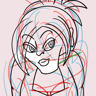
    It's a scientific fact now; Men look at the face of a naked woman before noticing the details, so you'll need to make it a GOOD face to get them to see the rest. Keep the emotion in line with the rest of her body, but make sure to give her face the star treatment. She should either be focused on her target (see the notes on power), or she should be sending messages to the viewer; do NOT make her look vapid, clueless, blank, or otherwise not-all-there. Let her have some emotion, and make sure to get the proportions right there, if nothing else.
Hopefully, my latest experiment in this will see if I've at least gotten myself on the right track . . . fortunately, people seem more willing to forgive a bad pinup versus other types of artwork.

Gee, I wonder why.

Tuesday, June 26, 2007

Buffers are full of win.

I probably enjoy talking about buffers too much, but that's because buffers are fugging AWESOME to have. Who doesn't like the idea of being able to put up oodles of strips without any (future) effort on their part should they decide to take off for a few weeks?

The idea is simple: You work ahead now so that you don't have to work as hard later if you don't want to. Of course, it's also addictive in that once you start a buffer you don't want to stop having one, and so it often becomes a matter of racing yourself to keep your buffer from shrinking away back to nothing.

Swearing by buffers has both benefits and drawbacks. While having one basically ensures that you can always meet your deadlines, it also means you miss the chance to put up those personality-defining 'author's notes', Dead Piro Days, special strips, and other quirky off-beat replacements that go up when people can't think of a strip. People tend to like seeing a little humanity in their artists; being able to empathize with them is powerful.

A drawback I've noticed in my own experimenting with buffers is how hard it is to hold them back from the public - after all, they don't do me any good while they're sitting on my hard drive. It's a delayed payoff for an unknown reward, in other words, and that part is certainly dangerous.

Still, I kinda like being really far ahead of myself...

Sunday, June 24, 2007

Carry your Sketchbook. Always.

Unless you're already printing up business cards and pamphlets for conventions, you should always have some example of your drawing skill on hand (if not for everyone else to see, then to give you something to do once the batteries on all your other electronic toys run out), so keep the sketchbook nearby.

For best results, make sure it's sturdy, tiny, and personalized to hell on the exterior. I prefer Moleskine, but that's because they have heavy enough covers to not require a lot of support, they're self-fastening, and they can also hold onto incidental papers (like tickets, reciepts, money... if it's paper, it'll do) in a pinch. You'll probably take a year or two to fill one of these up, so the durability will be well worth it. Don't worry about the paper thickness unless you're dealing in things like Sharpies or watercolor.

Take it everywhere. Use it for everything. Some of the more interesting pages in my books are where pencil sketches have been covered up by physics notes in ink. If you don't know whether or not you're doing this right, you're not doing it enough.

You have to do something when you're not in front of a computer, right?

Saturday, June 23, 2007

Page 25: A Day Early and an Explanation Short.

So we've finally managed to get something along the lines of explaining what Jigsaw is and why Damien being 'Touched' somehow gives him more knowledge into the Dead Inside than other folk. It'll become clearer as we go that whether Jigsaw knows (or wants to admit) that she's more than just a little 'different', to some people it'll be plain as day . . .

And today's early post is a great example of why it pays off to have a backlog -- it makes taking off on update days a whole lot easier, with the minor exception that it means I still have to handle the update manually.

Worse travesties have occured, I'm sure.

4 Quick Ways to Make Drawing Comics Simpler

  1. Silhouettes are your friend.
    Yes, they're a slight cop-out, but if enough of a figure is showing that we can still make them out, you're good to go. You still have to sketch enough to know where to add detail to the edges, but done right you can limit your lineart and avoid coloring more figures than necessary to get the point across.
  2. Tell the Story.
    Stupid, but if you don't need to show off your character's Gucci Purse in every single panel, why do so when just her face will do? In fact, if you don't need to have all her face in a panel for that matter . . .
  3. Pull your 'Mental Camera' in and out of the shot.
    Pulling either really tight in or very far out can send two different dramatic messages to the story, and both of them mean less work for you if you know your world well. Close-ups alert the reader to key emotions and other intimate details, allowing the reader to feel as if they're channeling a given character and experiencing the moment. Distant shots add drama and give us a bystander's view of the events at hand, as though we were watching in real life.
  4. Don't make every panel the same size.
    Readers tend to look from top to bottom, left to right. Have your Panels reinforce this idea; using different sizes and widths simply keeps things interesting and tends to help the reader's eye maintain focus. Also, when you're drawing out expansive scenes that attempt to have a background, being able to use different sizes lets you devote more time and space to the 'showoff' panel.

Hey, if you're going for broke when you draw anyway, nobody ever said you had to break your hand while doing it...

Labels: , , ,

Thursday, June 21, 2007

5 Reasons to Love Web 2.0

A big thing I encourage when it comes to marketing tactics is to use the routes that your competition doesn't. This often gets confused for viral/guerrilla marketing, but mostly it's just inventing new ways to reach out to your audience. A lot of the time, this means using some of the new 'in' technologies of web 2.0, and here's why:
  1. New utilities mean the Older competition won't use them.
    Well, why would they? They're already popular, and a contented brand doesn't push as hard as a new one struggling to get the word out. Of course, they get more bang for their effort, so it's a trade off, but at least that's a few less people you have to worry about for your competition.
  2. New utilities are ravenous content-vores; at worst, it'll be digested quickly and forgotten faster.
    Unlike LiveJournal and other forum-type software where all your most embarrassing moments will remain displayed for eternity unless you make a concerted effort (or end up mistaken for a pedophile), bad content on 2.0 gets buried quickly under mounds of new content, if it shows up at all. Thankfully this means that unless you fail so hard it becomes infamous, you have a good chance to change your behavior and try again without much effort.
  3. The best ones are also super-easy to update, which allows you to be more regular.
    Twitter's a prime example: 140-characters-or-less posts, doable by SMS, IM, or through your computer. Basically, when you're just standing in line somewhere, you now have time to fire off a quick post. I use mine for keeping people posted on my buffer, witty one-liners, or other things I might forget later.
  4. They make you look more accessible, and accessibility is king.
    Artists tend to become more reclusive as they get bigger, which is fine for us since it means that the more accessible you are, the more likely they'll come to you even when you're not their favorite, but they still like you.
  5. You're putting out lots and lots of content for later.
    The people who will be real fans of your work will want to swarm over every single detail you already have out there; yes, it's stalker-ish, but it's true. You may as well let them get lost in your own content so they remain enamoured longer (and also to keep them satiated before they start clamoring for more)
So go ahead and try some new technologies and sites. Worst case, you wasted a little time, but in the best case, you're tapping into a whole new market.

Wednesday, June 20, 2007

Stay Away from the "Real Artists"

When I'd first started the blog, I had a huge diatribe written out about DeviantArt and how while the site had useful features, the DeviantArt community itself was poisonous and essentially the MySpace of art sites, with the exception that you have to pay good money to DeviantArt to properly assault people's eyeballs. I deleted it for (among other reasons) believing that I was being heavy-handed to blast the place just because they made it too easy for everyone to get a page there; after all, making things easier is something any person starting out in a new field wants to encourage.

After roughly a week's worth of sitting on this, I realized the problem wasn't Sturgeon's Law; it was the presence of the "Professional Internet Artist", which falls in the same vein as the "Internet Tough Guy" but with minimally more marketable drawing skills. They might be big people in a certain corner of the community, or they might actually be pretty decent artists, but the main distinction is that they either:
  • Still hang out too much online in certain communities to be anything worthwhile, especially if they work in a digital medium. Yes, becoming known in communities is important to becoming well-known, but at the same time, if you're there too much it's an admission that you've got nothing better to do (which, if you're starting out, is at least partly true) or you're a lazy artist. Being a Lazy Hacker is cool; being a lazy artist isn't.
  • Seem to think they know exactly what's wrong with your attitude and your work, but at the same time aren't willing to help you do anything about it. The reason is that they have no incentive to give you any advice other than "go away and come back when you're better", but we'll get to that in a moment.
While it'd be all too easy to say they're just assholes for the sake of being assholes, we'll have better luck actually getting to the heart of the difference why (at least if you're going into a niche part of the art market like comics) it's best to just avoid these folk. Most of the rationale can be traced back to a key difference between a 'Professional' Artist versus a 'Professional' Blogger (and let's face it, I keep saying your comic's a blog for a reason): Professional Artists work on individual commission. Professional Bloggers work on collective effort.

As to why this makes a difference, look up to where I mentioned "having no incentive" to be nice to you and give you appropriate criticism. Artists work for money just like everyone else, but they work for only one person's money at a time. Until the artist gets to a level where more people are willing to pay than he's willing to work for, he has to make himself stand out as above the 90% crap line; there's a lot of ways to do this, but the favored method seems to be making everyone else look like crap through criticism.

Criticism can be a subtle form of trolling, in that any sort of response to it tends to make you look like an asshole for questioning it (unless it's really obvious they've overstepped a boundary), while for the person giving the crticism it gives them twofold benefit in making them look better than you are and either forcing you to accept the insult (thus proving them right) or reject it (which gives them an opportunity to label you with a bad attitude, giving them the high road). This isn't to say all criticism is bad, but "You forgot to draw Sonic's ears in" is far less likely to get a bad response than "Your anatomy is awful, I'd never commission someone of such low skill."

Depending on collective effort, meanwhile, is a necessity for comic artists and bloggers alike because there is far more strength banding together for them then there is in standing apart the way freelance artists do. The reasons are obvious: Bloggers depend on collective authority and the connections of the internet to maintain their positions of power, and likewise, comic artists working together can leverage conventions and other money-making opportunities that would otherwise be inaccessible singly.

Comic artists won't have nearly the same level of arrogance regarding their work because they realize that beyond the general skill involved in 'making art', comics require the ability to tell a story as well: this means skill in paneling, lettering, and other comic-specific traits that have to be balanced in along with the ability to make good artwork. Having 'great' artwork is now relative because it has to be balanced in with producing lots of it in a way that is interesting for the reader to follow, and of course, the more you work with other comic artists, the more likely they will draw new fans to you as well; some of the best artists work as parts of a comic collective that assist and support each other by association.

Ergo, comic artists have incentive to be as helpful as possible; a rising tide floats all boats, after all, and anyone who can get new readers into their comic can also bring new readers into everyone else's comic as well as their own. Since comic artists only require a little from everyone instead of depending on one person's commissions, working to get lots of new readers (of which a few will hopefully pay more to get something special!) is a key goal of their work.

So support your local comic artist. You'll be supporting everyone else's too.

Labels: ,

Tuesday, June 19, 2007

Whatever Software You Use, Know How to Use It.

In previous examples of how I work on the comic, I've mentioned a plethora of programs used - Illustrator, Paint Shop Pro, Photoshop Elements, etc. It's not that these programs are the best for what I want to do, but instead because I know a little of each and so it's useful to have such experience in a few different programs, enough that you can fake your way around others if necessary.

Encouraging people to experiment with different features and methods in these programs tends to work better when you're not in a hurry to get the results, which is all the more reason to build up a backlog. There's no secret to this one; a little bit of time will help you find the magic bullets, and it's best to learn on your own. How else do you plan on remembering it?

Monday, June 18, 2007

Stop Starving Yourself, Stop Starving Yourself...

Starving yourself is bad, mmkay? And the cutting. And the booze. I realize that whatever a man, a woman, two dwarves and a parakeet get up into the privacy of their own home is their business, but for God's sake, man, making yourself feel like shit makes your work feel like shit too.

Whether you really want to admit it or not, your work is an extension of your well-being on top of everything else. Happy artists get work done. Not-so happy artists get work done too, but it probably won't be their best stuff. There's being able to convey certain emotions in your work, and then there's dragging yourself into these deep dark pits where you can't seem to do anything but sit in front of the TV watching The Price is Right and sucking down cheese. Or maybe that's the point in the creative process where you decide to get your character captured and raped by some psychopath. Either way it's not the place to be.

Sure, there's times where pain is acceptable, necessary, and even beneficial. Self-destructive behavior is none of the above. Don't fool yourself into thinking that this is limited to physical actions either: DeviantArt pissing you off because you're not getting enough hits/comments? Stop visiting. E-mail making you mad? Check it less. Troll getting on your case? Block his ass.

The simple matter is that drama, whining, bitching, and moaning in general are turn-offs. Sure, you can still be successful AND be completely emo, but don't expect it to get you further than the ones who look unflappable and know where to cut their losses. It's a reputation thing, and it's not that people won't sympathize with you... it's that if you bitch over everything they'll wonder when you'll start bitching about them instead.

If you don't want to look back on your posts and cringe, stop writing the posts in the first place and spend more time doing something about it.

Labels: , ,

Sunday, June 17, 2007

Page 24: Yes, we have a pink... blonde... princess. Oh Dear.

As more and more of the pages go up one at a time (and I consequently get further ahead in the story), it becomes harder to love certain pages for one sort of experimentation done in them or another. This is one of those pages where I sorta feel I overdid the background shading, because it looks like we're watching a game of Super Paper Last Resort. I will admit I'm pretty damn proud of Nathan's fishnet gloves though. Those were a real feat to pull off.

Wanting to criticize my earlier comics is probably just an inevitable consequence of keeping the backlog, and while I know I'm saving myself work down the road, it's also difficult to keep holding the other work back and only leaking bits and pieces of it, through some of the ads I've been making for the site and otherwise.

Sooner or later I'll figure out an awesome use for them. For now, I art.

Labels: ,

Saturday, June 16, 2007

7. Beware the Family Friendly Label (unless you're really REALLY good at it).

Howard Tayler is one of the heavyweights in webcomics, and he's pretty damn successful at it. He's managed to make a daily strip run for seven years (and the majority of the past four without fail), he's sold books, done cons, gets his stuff to go for hundreds to the right fans, and manages to do it well enough to support a sizable family on the profits. He clearly knows what he's doing when we works on this stuff.

He also, apparently, gets flustered at fake ads referencing Orgasms-Per-Hour and random mothers of young children giving him crap because of said ads. As much as I hate to inject myself into the obvious drama this has brought to his fanbase, I can't say that 'orgasm' is a dirty word most kids would even understand (as opposed to something they already recognize is a bad word, like 'cunt'), and quite frankly I'd rather have a young child looking at an ad and realizing it's aimed at older people (thus ignoring it), than the previous ad which was talking about creepy old men who can erase your memories and also happen to be driving schoolbuses. Apparently it's okay to scare the crap out of young children and make them afraid of schoolbus drivers, but not okay to let them see the word 'orgasm'.

But, as I said, Mr. Tayler knows what he's doing, and I know why it's got him in such a righteous snit: he insists on total control over which ads appear on his site, while BlogAds refused to give him that total control, and this makes sense that he would be upset with them over such a distinction along with their bait-and-switch tactics. He also insists on a family-safe label as well, however, which makes sense for him and his audience, but not necessarily with the same universal approval. Then again, he's also someone who's been running for the past seven years on a daily comic; that kind of longevity gives you the power to dictate your own terms pretty damned well, and he is more than entitled to maintain whatever standards he likes.

I bring up Mr. Tayler and his recent drama as a pair of examples; On the one hand, we have a man who is clearly both good at his job and successful by webcomic standards. On the other hand, he's also bound by a stricter set of guidelines than the average artist, and as a result he has less flexibility to do what he wants and has to maintain that extra sense of vigilance over ads he deems inappropriate. The message is in the method: If you try to make things safe, you're causing yourself extra work later on in order to maintain that illusion of safety.

Family-Friendliness isn't the 'natural state of the internet', so to speak, and without a certain sense of what's good and what isn't (or your own personal canary in the coal mine to let you know what's what), you run the risk of making things 'too safe' and the resulting material has no effect whatsoever. If you need a certain amount of color to your humor, there's not much point in trying to 'dilute' it to make it 'family friendly' when such a distinction kills the joke.

This statement ties back to a basic Comic Commandment: Know Thy Audience. It doesn't shock me that a father with several small children insists on having a comic meet these Family-Friendly standards. It shocks me significantly that a college graduate in his mid-20s aims for one too, especially as it's meant for a nostalgic audience. When you aim for a niche audience (which, let's face it, being kid-safe is a definite niche), you give up some of the affordances having a webcomic often gives you, and require the rest of your work to pick up the slack since you can't just "go to the well".

As for my own work? I freely admit Last Resort isn't meant for a children's audience. There's no real way a story about a bunch of condemned criminals walking into their deaths (and that's without adding in the vampire elements...) is going to BE family-friendly, either. I can swap out a few of the invectives I use in the comic and censor it down to a PG level, but quite frankly I'd rather leave them in as fair warning about the level of violence and plot therein.

Family-friendliness means people don't die on-screen. Family-friendliness means you keep a minimum amount of clothing on. Family-friendliness means you can't let your characters say whatever they feel like. Family-friendliness means you don't have references to 'satanic' creatures like vampires, apparently, but that's a whole other complaint about people confusing Family Values with Christian don't-rock-the-boat Values. Eventually you realize that the Family label is just like the Adult label: once you accept it, you start locking yourself in and squelching your creative energies.

Given the choice, I'd much rather define the label than let the label define me.

Labels: , , , ,

Friday, June 15, 2007

"Top 10 Ways to Make your Comic Successful"

... or more importantly, why such things are a crock of [insert favorite word for excrement here].

Yes, I will admit this is self-zinging, because I'm writing a blog on how to make your comic big and yet I'm insulting other people posting about . . . you guessed it, how to make your comic big. It's not that I'm trying to cut down on the competition (though I'd be a fool not to admit I'd like being ahead of the pack).

It's that I'm sick of reading poor excuses for "Do this and suddenly your comic will rock". We all tend to know, instinctively, which ways work and others don't; unless we're incredibly new and naive as to how advertising works, they don't often say anything you don't already know, have tried, and have chiseled at enough to know it's either taking a lot of work a certain way, or like enough to try elsewhere.

Here's a hint: The real tricks that work are the same ones that worked on you when it came to other people's comics.

Your audience, whether you want to admit it or not, is just as smart as (if not smarter than) you, and so anything less is insulting to them. If you notice a certain trick working on you, then you should emulate the same tricks that lured you into reading someone else's comic and adopt them for yourself. Fortunately, this has the advantage of making emulation not just easy, but also proven through your own experience.

The next reason I tend not to like the Laundry Lists of Making Comics Successful is that it assumes all comics are the same sort of material, aimed to the same sort of audience, with the same sort of skew. All other things being equal, it's asinine to think that by doing the exact same thing as everyone else is going to put you AHEAD of everyone else. You're just playing catch-up at this point.

Besides that, if the person giving the advice knew anything of what he was talking about, he wouldn't be telling it to you as a way to get more attention for himself, which (admittedly) most blogs about this sort of niche all have at the heart of things. At least in reading my work, I freely admit I have no clue what's going to make or break me, and by the time I get there, this blog will have already detailed the real tricks involved.

And when I say the 'Real Tricks', I mean I'm not going to tell you to go to site A and register yourself because it worked for me. Here's a quick stab at my own top 10:
  1. Doing things the way everyone else does them only puts you as far ahead as everyone else.
  2. There's thousands of webcomics. Make sure yours is different enough to get anywhere.
  3. Leeching off of other comics' readerships will only get you so far, but at least it's a start.
  4. Expect to be struggling at it for at least a year. Even on the Internet, cults take time.
  5. If you can't be regular, neither can your readers.
  6. Most of the people you're advertising to already read comics. There's far more people in the world who don't. Try advertising to them instead.
  7. Beware the Family-Friendly label (unless you're really really good at it).
  8. Your Comic doesn't have a blog. Your Comic IS a blog. Treat it like one.
  9. Eventually, advertising comics is like advertising anything else.
  10. You are vying for people's attention spans. Your competition, therefore, is everything else in the world. Start digging the trenches now.
Note the lack of "Go to these sites and fill out these forums." That's cause these are the keys themselves; once you realize why these statements are all true, you can start aiming your crosshairs better.

More to the point, once I realize why they're all true, I can stop ranting about everyone else's bad aim.

Labels: , , ,

Thursday, June 14, 2007

Five Tips for Selling Yourself First

Online, an artist is only as good (or as bad) as their reputation. Some key concepts:

1. People don't just want an artist anymore. They want a friend.
Make yourself available. Chill in other comics' forums. For the first few months of your comic's existance, resign yourself to the idea that you're going to be leaching off of other established artist's groups, because quite frankly if you know how to reach any other audience you'd be writing a blog like this one. It may seem counter-intuitive and vaguely insulting, but for what it's worth, it's a lot cheaper than most other advertising routes open to you.

Don't worry about spreading yourself thin; Even if all you do is make a few high-profile posts on a forum, it's probably gotten you some decent legwork done, and that's umpteen more people that know about the comic when they wouldn't have otherwise.

2. They want you to spend some time on them personally.
If you're too busy to talk, your would-be-fans are too enamoured with other people to pay attention to you. Also, let's face it; you're drawing a WEBCOMIC. You have time to burn.

There's a few ways to accomplish this, and either it involves some "Author's Notes/Blog" type comics where you speak directly to the readers using the strip, or you keep a separate blog/LJ as a supplement to the comic. My personal favorite toy in this regard is using Twitter: It encourages you to write very tiny posts, so you can not only keep off-topic-ness to a minimum, but you can write LOTS of them in a day and nobody minds. Heck, that's what it's best used for. It still keeps an archive of everything, and it's accessible from so many places (Facebook comes to mind as the most recent 'new frontier'), so your fans can't help but keep up.

3. They want you to draw not just for their entertainment, but for THEM.
We're talking commissions, guest strips, fanservice, and other little things that give in to a reader's desires. If you're lucky a few of them coincide with each other and someone's commission of your character in a cheesecake pose can be used for merchandise later, effectively allowing you to be paid twice and get some good mileage out of the work. If you decide to do some sexy pinups for the hell of it anyway, don't think "I should be working on the comic instead of this"; think "I can use this as a wallpaper for a donation incentive"!

Unfortunately for you and your wallet, commissions are an outreach of reputation, so your reputation will affect the number of fans, which in turn affect the prices you can charge. The general translation is to wait a little while until people start asking you for art, then offer to charge. If nobody offers, start doing art for your friends, call them 'commissions' (even if they're technically freebies), and see if that gets more people to bite once they realize you're not above drawing their characters.

4. Keeping your readers informed on your life helps them care for you as a person.
Keeping a good comic is Internet Karma: Be good to the net, the net is good to you. Even if you're doing just fine without people's help, you'll still want them to donate, because money is a great incentive (especially to other people who wonder why you're wasting your time!). The more you can convince your readers you're an all-around awesome person and you can use the cash wisely, the more they'll give you what you need.

When you DO fall on hard times, you'll want the press to keep you afloat and your fans to keep looking out for you; you can't very well do it when you're laid up, so you may as well earn the karma now while you're healthy.

5. Be aware of the 'content flow'. More importantly, make sure it's consistent.
People like an artist they can keep their watches to, if only because it means they stand half a chance of keeping up with their work. Reading the archives of a webcomic can be daunting, especially if the comic in question is old. The best solution available is to make sure that users don't fall behind any more than they have to, which typically means update schedules for everyone's sanity.

How to decide on an update schedule: Figure out how many strips a week you can do when you're at your absolute goddamn worst and there's three finals to study for. Set the schedule accordingly; we want to aim for your minimum amount you can accomplish in a week, so you don't kill yourself trying to update too quickly. As a bonus, it also gives you a chance to work ahead and save future strips (known as a buffer or a backlog) so when cool stuff comes up, like conventions, trips, or just plain "I-don't-feel-like-it"-itis, you still have stuff waiting to go.

Don't worry about ever having 'too much' backlog, either; Howard Tayler keeps around 30-50 strips in his buffer fairly constantly, and I'm sitting on sixteen weeks of strips as of writing this post. Of course, we have different reasons for keeping them; Howard uses an automatic updater and being paranoid about his ability to produce the strip later always works in his favor, so keeping the buffer huge is a big advantage for him, while I'm building my buffer during the summer months so I can update at college with very little stress involved, or possibly speed up my update rate if it becomes insane to manage.

If you ever do have to do without a strip, at least put up something so your fans know something's up. Get Guest Strips and Fan Art to fill the void while you're out. You can accelerate the schedule or supplement it (like I'm doing with this blog), but slowing it down tends to leave a bad taste in people's mouths. Respect the update schedule, you respect the fans.

Respect the fans, and they respect you.

Labels: , , , ,

A Painful Lesson in Hesitation

Yesterday I signed onto the Anime Weekend Atlanta Website to discover that tables in Artist's Alley had all filled up. I'd only found out about them opening on the 10th, so at some point between the three days it took me to decide to go for it, they'd sold out; a rather gut-wrenching reality check about how dangerous doubt actually is.

'Doubt' is fear. Fear causes good ideas to get tempered down into mediocre, presumably more palatable ones, and in the process changes the idea and turns it into garbage. Fear is what people go for in trying to hit a 'good' market, in second guessing themselves, in trying to listen to everyone when they tell you "Nobody likes [your genre], get a new one".

In short, I'm sick of fear.

Wednesday, June 13, 2007

Standing Out by Blending In

This ties back to the Lazy Hacker approach: looking for a method of 'least resistance' in order to get exactly what you want. Fortunately, the Lazy Hacker approach also lends itself to a great trick when it comes to getting noticed; by only altering the cosmetic elements of what's involved, viewers get a whole new experience even if it's the exact same everything else under the hood.

To wit: This blog is being created thanks to Blogger, and as such I grabbed one of the first templates I could think of. Actually, I ended up grabbing 'Rounders' instead because it was more grok-able than the first one I picked up.


I shouldn't have to go too far in explaining why this simply wasn't good enough for my tastes. It's a perfectly fine layout, yes, and it has nice rounded edges, which looks better than sharp corners. But the colors are all wrong (despite the header being a nice red), and if I wanted to change any of the colors, I couldn't deviate far from the presets without the corner images themselves clashing. Furthermore . . . it looked obvious it was a Blogger page. Regardless of what my readers might 'think of me' for using it, leaving it in a default setting didn't make any sense at all when it was completely different from my comic site's layout. If nothing else, it had to look like the two pages went together.

To Fix: One of the few saving graces of the fact I'd picked up an otherwise unsuitable template was that (as I mentioned) the code was quite clean in comparison to some of the other templates, and I had a general idea that the main fixes I needed to do were mostly image-based; in other words, I needed to find the image URL references in the template given, and replace them with a few of my own. To keep the amount of necessary work to a minimum, I would often reference the template images given to make sure I was on the right track with sizes and general image/page anatomy involved.


The main issue with this approach was that the template was designed to work with the specific images it had, and so where mine deviated, I had to adjust the code to make them fit. Typically this involved altering the 'padding' of the given sections and constantly hitting the 'Preview' button on the template each time I made even minor changes to see what effect I had.
Obsessive, perhaps, but it worked.

Wherever something didn't fit in with the new scheme, it was "commented out" of the HTML coding, just in case I realized I wanted it for later (which is where that ugly text that was replaced by the new banner image went) . For the most part though, the actual layout of the page went untouched — the profile box barely looks different at all, although that's more by coincidence than anything else. The color DID change slightly to match the banner's edge, but that's about it.

The end goal was achieved in only a few hours' time though: We've broken free of the Blogger default, and made it look like it actually belongs to the domain. We even managed to use the favicon to replace the arrows in the bullets, adding to the design reinforcement. It's not a completed change-over, but it's sufficient enough that it's worth leaving it alone for now to see how well it actually works.

Labels: , , , ,

Tuesday, June 12, 2007

Five Secrets of the Lazy Hacker

Most of us know what a hacker 'is', or at least think we do; the image of some sweaty nerd who is anything but a healthy weight banging away at the keyboard and doing God-knows-what to our computers. Really, it's just someone who is so damned determined to get Result A that they're willing to do Task B, even if it means voiding a warranty or rooting around in the binaries to find out how to do it. Since at least some of making a webcomic means controlling the webpage it's viewed on, learning to be a Lazy Hack can be quite useful:

Lazy Hacker Secret #1: Never code for yourself what someone else has already put out on the Internet.
We don't mean theft, either. If you want to find a way to put Twitter into an image so you can have it in your forum sigs, guess what: Someone at TwitterSig already did it for you, albeit you might not like the image. Likewise, using templates for MySpace, Blogger, and other paste-and-bakes is already quite possible, and so it shouldn't be an issue to find one (or better yet, find one you can customize).

If you can only find close-but-not-quite what you want...

Lazy Hacker Secret #2: Grok the Code that's already There.
You should know what clean, commented-out code looks like when you see it, because it actually makes SENSE to read it. If you're not working from code that's already pristine, make it pristine. Tabbing-in nested portions and spacing out your work isn't just nice to read, it's essential to learning anything. Lazy Coders don't make their code easy to read because they don't want you to read it, so it'll be up to you to figure out how to clean it up.

Of course, sometimes you just don't want to read about that damned stylesheet any more than you have to, so...

Lazy Hacker Secret #3: Compartmentalize Repeated Code.
You'll need to learn some php, but we're talking very minimal php, and this is talking about actually coding stuff. A fun thing to understand about PHP is that it not only allows for code execution, but it also allows for object-oriented coding, even when all you're doing is regurgitating HTML. Between the choice of designing a header that has to be copy-pasted across umpteen pages versus telling each page to retrieve from "header.php", and then only having to change one file versus umpteen whenever you want to create a change . . . well, that's not just Lazy, that's downright clever.

But now we've just asked you to learn a little trick to make your life easier! That's okay, because since you're trying to be Lazy, obviously you should...

Lazy Hacker Secret #4: Only Learn What You Need Right Then.
Just because it's not the way you were taught in school doesn't mean it still won't work. When it comes to HTML, CSS, PHP, and all the other Alphabet-soup languages, you should only seek out the parts that get the job done; you'll understand those bits easier, and even if it doesn't make sense, at least you know what works. Language references are just littered across the internet, and picking up the few bits you need from each one should be easy, right?

Once you've done this much legwork, and you're still stumped, it's time to use the last Tip...

Lazy Hacker Secret #5: Know Who to Ask.
When it comes to simple HTML questions, it makes sense to ask your peers first. If you feel you need more advice, forums for programmers and books on the stuff are meant to be used. As long as you sound like you've done at least a little research, most geeks will gladly either give you the next few steps, or soundly correct you (but give you the right answer anyway).

Caveat: Make sure the question is worth their time. You don't ask Linus Torvalds what the 'ls' command is, and trying to jump the hierarchy of expertise makes you look dumber for asking and also makes it less likely others will answer.

A little effort goes a long way with a Lazy Hacker, and while it won't make you a complete programming guru, at least it'll be enough to make what you've got look worthwhile.

Labels: , ,

Monday, June 11, 2007

Not with a Bang or a Whimper

So how does a webcomic become successful, anyway?

. . . the truth of the matter is that I don't have a clue any more than the people who have successful webcomics. The people who don't have successful ones don't have much of a clue either, but the point is in seeking that part out, writing it down so other people can take advantage of it, and making both of us more informed (as readers and as a potential artists), and possibly convincing you that I know what I'm talking about.

A lot of what I'm going to say will involve thinking NOT about webcomics, but about how various tricks and techniques from other fields can be applied to webcomics and how they can make you better at what you do. We are, after all, talking about a medium that is still in the 'gooey, sticky mess' phase of its inception; a lot about what makes one comic great and another comic fail isn't always clear, and by the same token, what made a great webcomic five years ago isn't necessarily what makes a great comic now.

This is expected, after all; this is the internet, where sites come and go, people get burnt out, new artists take their place, and fortunes are made in ways that make the old content models cringe. Unfortunately, thanks to that same structure that allows a brand new artist to break out and become an overnight sensation, there's also a lot more 'slush' that needs to be waded through because it's also been made just as easy for everyone else to try and do the same. The goal of anyone trying to make it is now no longer impressing just a few (carefully chosen people), but finding ways to stand out and become the next big thing.

Simply put, that involves a little education.

Labels: , ,